Exploring the depth of color theory reveals a fascinating world where hues are not just aesthetic elements, but powerful tools that can significantly influence design. Understanding color theory offers insights into creating harmony, contrast, and evoking an emotional response, making it an essential skill for anyone involved in design.
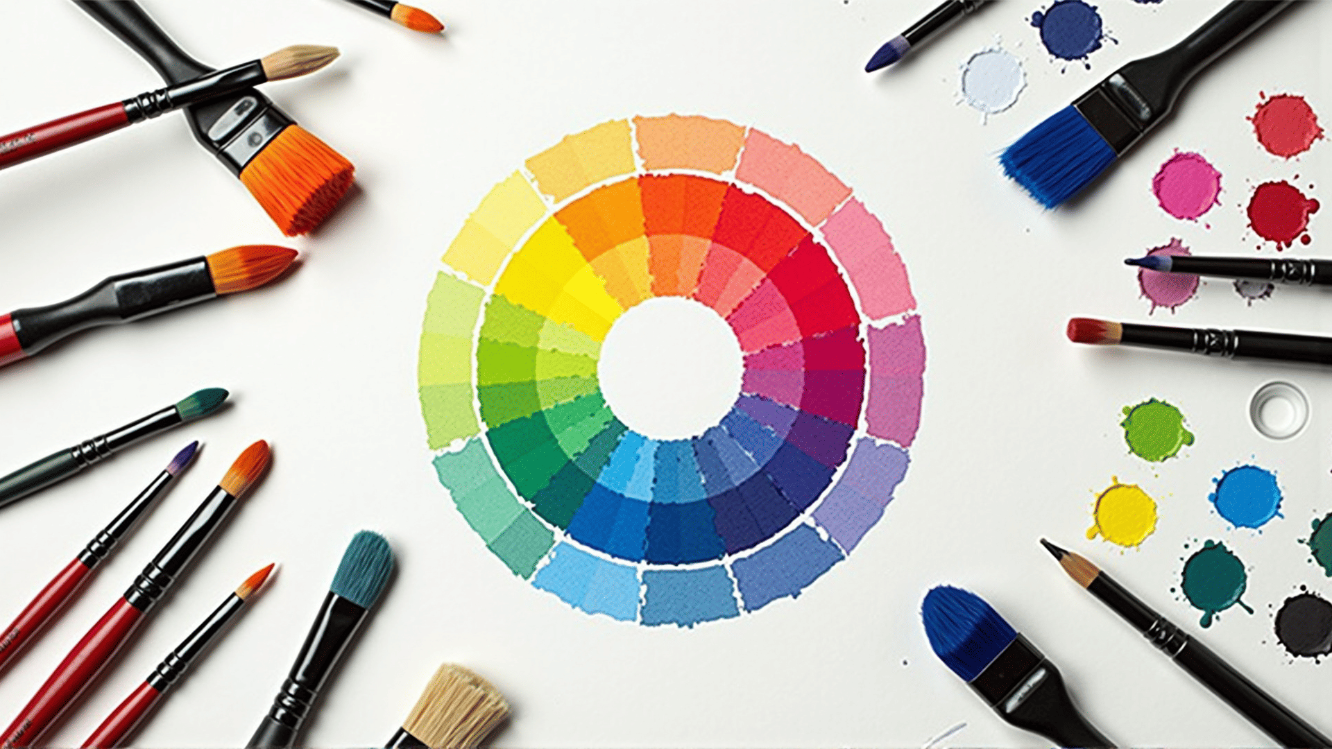
At its core, color theory is the study of how colors interact and the effects they have when combined. It encompasses the principles and guidelines used to communicate with color, rooted in both art and science. A crucial element is the color wheel, a circular diagram that displays relationships between primary, secondary, and tertiary colors. Comprehending the color wheel is foundational for effectively using color in design.
Harmony in color refers to the pleasing arrangement of colors that create balance and a sense of order. This can be achieved through various schemes, such as complementary, analogous, or triadic color schemes. Complementary colors are opposite each other on the color wheel, providing a high contrast and vibrant look. Analogous colors, found next to each other on the wheel, offer warmth and unity. Triadic schemes, formed by three evenly spaced colors, bring about a dynamic and balanced visual effect.
Contrast, on the other hand, heightens the elements that stand out to the viewer. By using contrasting colors, designers can draw attention to specific aspects of their work, guiding the audience's eye to critical areas. High contrast between colors is particularly effective for making text or focal points stand out against a background.
Beyond aesthetics, colors possess the ability to evoke emotions and set a mood. Different colors can trigger various psychological responses. For instance, blue often imparts calmness and trust, while red can evoke passion and urgency. Knowing the emotional resonance of colors allows designers to align their choice of hues with the intended message or feeling they wish to convey.
Moreover, cultural contexts can influence color perception. While white represents purity in many Western cultures, it is associated with mourning in others. Understanding these cultural nuances is vital for designers working in diverse, global environments to ensure their designs communicate effectively across different cultural landscapes.
The power of color theory in design is undeniable. Whether creating a soothing environment, highlighting essential elements, or stirring an emotional response, the strategic use of color can transform the impact and reception of a design. As we continue to engage with visual media, the thoughtful application of color remains a key component in connecting with audiences on both a conscious and subconscious level.