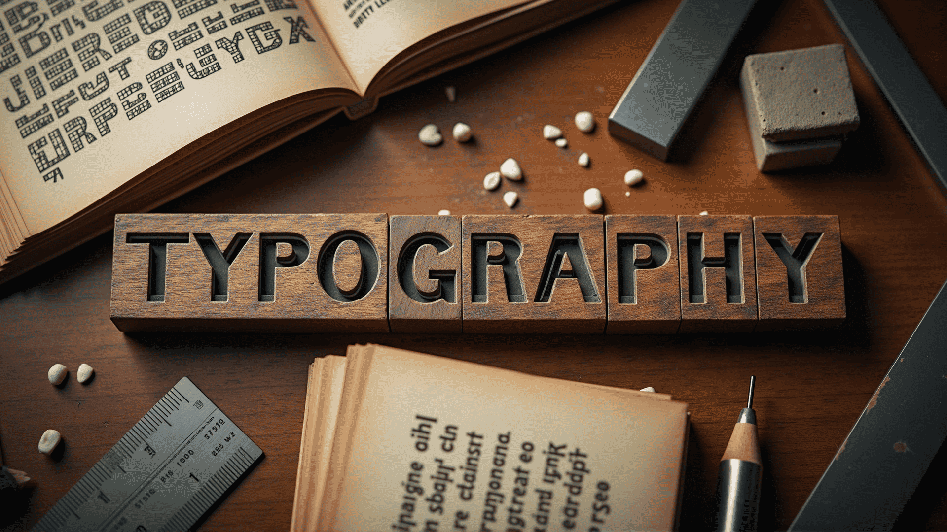
Typography is not just about arranging type; it's an art form that embodies the delicate balance between aesthetics and functionality. The craft of typography plays a significant role in shaping the way content is perceived and understood. Through the careful selection of typefaces, design enthusiasts and professionals alike can drastically enhance the visual appeal and effectiveness of their work.
The origins of typography date back to the invention of movable type in the 15th century by Johannes Gutenberg, which revolutionized the way information was disseminated. Over the centuries, typography evolved into a sophisticated form, encompassing various classifications that cater to different purposes and emotions. There are four primary classifications of typefaces: serif, sans-serif, script, and decorative. Each typeface carries its own unique history and conveys distinct characteristics.
Serif fonts, characterized by their small projecting lines at the ends of letters, are often viewed as classic and formal. They are widely used in long-form text for their readability. Popular examples include Times New Roman and Georgia. Sans-serif fonts, on the other hand, do not have these projecting lines. They offer a modern and clean appearance, making them ideal for digital displays and contemporary designs. Arial and Helvetica are well-known sans-serif fonts.
Script fonts mimic the fluidity of handwritten text and are often used to add elegance and personality to designs. However, they should be used sparingly to ensure readability. Meanwhile, decorative fonts are employed to create a unique atmosphere or thematic expression. They are typically reserved for headlines or specific design elements that require a distinct visual impact.
The selection of a suitable typeface goes beyond mere preferences; it demands a thoughtful consideration of the message being conveyed and the audience it targets. Typography can influence the mood and tone of the content, guiding the reader's perception and emotional response. For instance, a formal document might necessitate the use of a serif typeface to command respect and authority, whereas a technology-oriented interface might opt for a sans-serif typeface to reflect innovation and simplicity.
In addition to selecting the right font, typographic design involves the careful arrangement of text elements. Factors such as spacing, alignment, and hierarchy play crucial roles in ensuring readability and visual harmony. Proper spacing between letters and lines can contribute significantly to how easily the text is read. Alignment, whether left, right, centered, or justified, affects the visual flow and balance of a composition. Establishing a clear hierarchy through size, weight, and style variations can direct the reader's attention to key information, making the content more digestible.
Ultimately, the art of typography lies in its ability to marry form and function, enhancing both the artistic and practical aspects of design. As digital platforms continue to evolve and the demand for compelling and accessible content grows, the mastery of typography becomes increasingly essential. By exploring its history, understanding its classifications, and mastering its application, designers can wield typography to craft meaningful experiences and powerful narratives that resonate with audiences in profound and lasting ways.
